A few months back, I was reviewing some internal apps we had in our organization, and this thing we humbly call the “library app” got my attention. We have a lot of books (physical copies) lying around, and we encourage everyone in the organization to read and apply/share what they’ve read. So far, it seems to be working.
A group of young developers was learning Grails, and they built this “library app”. I wanted to learn too, so I pushed myself to do something that ran on Google’s App Engine, and I ended up learning more.
UI and User Experience
I started looking at the current user interface of the one built using Grails. Here’s what I saw — a login page.
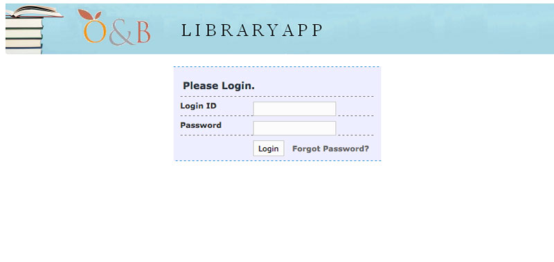
After logging in, I get the following.
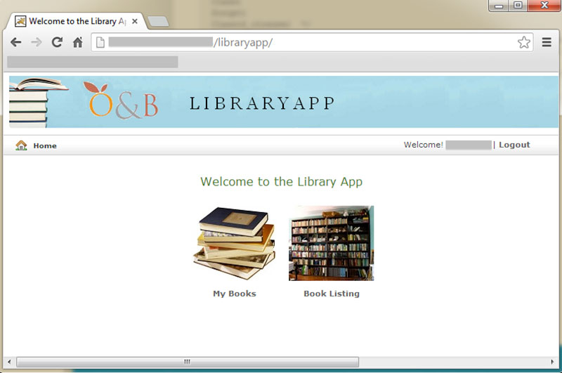
I asked myself, “What would a typical user do if s/he was greeted with this landing page?” My first response was, I wouldn’t even think of clicking any of the two icons. And here’s what I saw after clicking on the “Book Listing” icon/link.
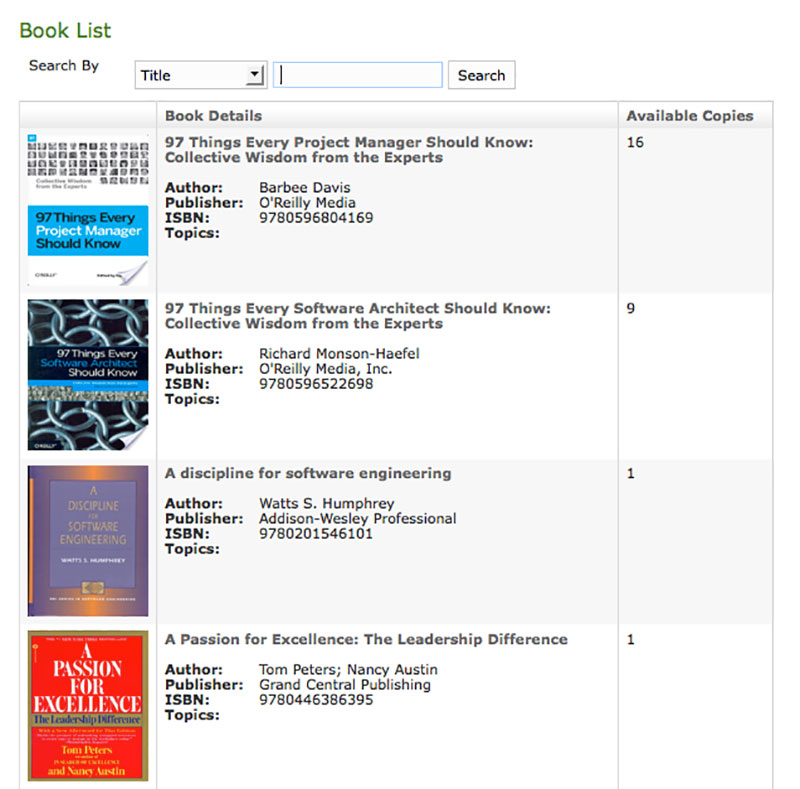
There was nothing there that “entices” me to explore and look at the available titles. So, I set out to create a landing page that would make we want to look at what’s available.
Early Feedback
Here’s what I came up with (largely inspired by iBooks and other similar apps).
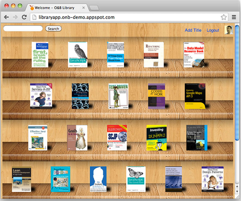
I didn’t build the code behind it (at least, not yet). I just started with some static HTML, deployed it to the cloud, and asked some colleagues to try it out. I was pleasantly surprised with their reaction. They asked if the app was a modified version of the one built using Grails. They also asked if I got help from our creatives team, and if it was written using Grails. Anyway, the early UI allowed me to get early feedback. And letting the landing page be seen without the need to login also helped (I guess everyone is too lazy busy to login).
Learning users’ unarticulated needs through a process of keen observation and interpretation often leads to breakthrough designs.http://en.wikipedia.org/wiki/Empathic_design
So, I proceeded to turn the static HTML into something more dynamic. I started populating the database with book titles. Then, it occurred to me that I was spending so much time entering the titles, authors, publishers, etc. Even though we have about 50+ titles, it was taking too much time. So, I asked around how the current version was being maintained. I was surprised that they did it pretty much the same way I did (adding titles one by one, and typing everything in while looking at the physical copy). I started thinking of improving this. (Seems like an unarticulated need here)
I saw myself Googling the book’s title every time I needed to enter its details. Light bulb moment! Why don’t I enhance the entry form and allow the user to Google it up, and populate the entry form?
After some rough JavaScript, here’s what I ended up with.
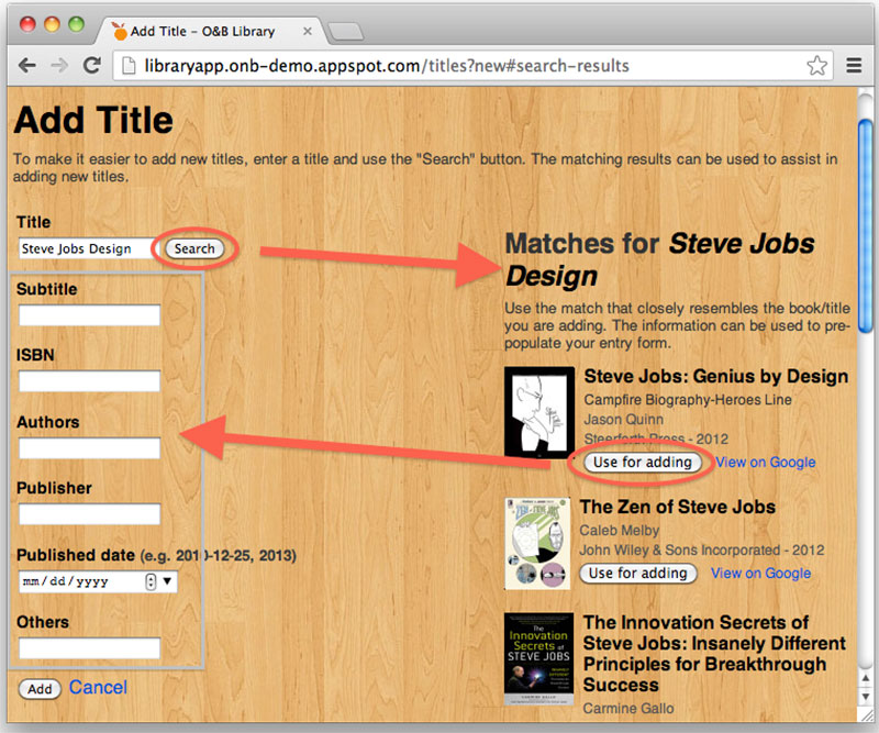
I added a “Search” button that would do the search (using Google Books API). The results are shown, and a button is added to use the book information to populate the form.
After I added this, I was able to add titles in no time! This would not have been possible for a user to articulate or express as a requirement. How would they know that APIs exist to help with finding book information? It’s critical to observe and experience what the user goes through when using your app to achieve their goals and/or perform their tasks.
I’m no design guru. This simple enhancement is far from a breakthrough. I hardly observed our office admin team use the existing library app. But I’m glad I had this experience, and I hope sharing it here would help others. I indeed learned more than just building apps!
Future Enhancements
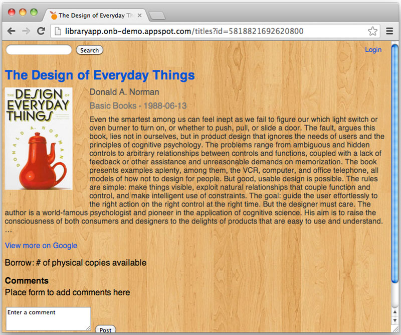
As you can see from the screenshot, I have not implemented the borrowing part of the app (yet). But I’m thinking of ways to add a “comments” section to allow users to post their comments about the book. I’m hoping that these comments shall further “entice” others to grab a copy, read, apply, and share.
Originally posted at: Early UI, Early Feedback, Better Results
