In our fifth week working on a coffee shop application as O&B’s Software Engineer Interns, we mainly learned about Wireframing, and one of the concepts greatly emphasized in our training was User Experience (UX).
As “implementers” of a product idea, our team was responsible for making sure that our application was designed specifically for the people who are going to use it.
Here’s our step-by-step process in creating exceptional UX:
1. Know your User
A vital aspect in building a great application is ensuring that users will actually benefit from the app. That’s why our first step was to make sure we were building the application for the correct persona.
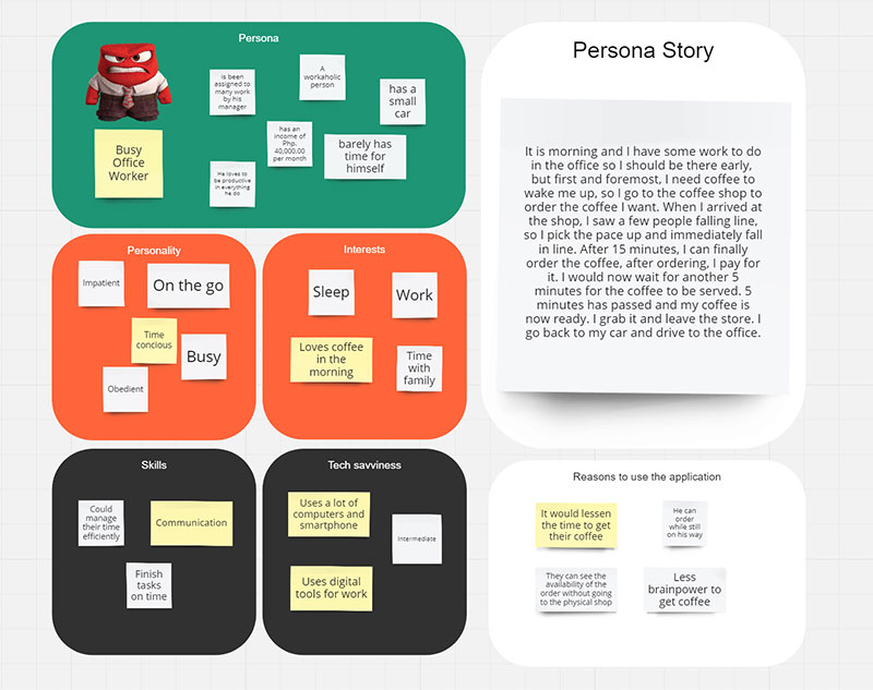
After discussing and analyzing potential audiences, we came to the conclusion that the best persona to target was the “Busy Office Worker”. To define the persona, we created a detailed description that identified and compartmentalized their interests, personality, skills, comfortability with technology, and even their day-to-day problems, which our application aims to solve. We saved this Persona Story in our Miro Board, an online whiteboard-style platform.
2. Add Minimum Features
Quality over quantity.
The number of features in an application does not define how good it is. Sometimes, minimizing feature complexity can make an app more usable depending on its purpose and the users’ goals when using it. Including plenty of unnecessary features runs the risk of overwhelming your user, and might give the impression that your app is too difficult to navigate.
Hence, our second step was to list down practical features for our app that seek to help our target persona’s life. Here, we made sure that the features we were trying to create fit our persona’s lifestyle and solve a problem that our persona has. While it was easy to come up with a plethora of features, we strived to add only the best ones that played an important role in solving our identified problem.
To ensure that we captured all our ideas and picked the best features, we turned to our trusted Miro board and listed them down in an organized way.
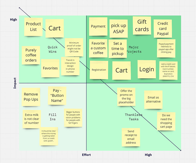
In our board, we divided the features according to their impact (how much this feature will benefit the persona) and effort (how much manpower is needed to implement that feature). We came up with the final list by prioritizing high impact features.
3. Create Your Wireframes
A wireframe, according to the Balsamiq Wireframing Academy, is “a schematic or blueprint that is useful for helping you, your programmers and designers think and communicate about the structure of the software or website you’re building.”
Given how important it is to have a user-friendly structure for our app, creating these wireframes was our next task.
In this part of our internship journey, our focus was not to beautify our application and prioritize its aesthetic. Rather, it was to organize our app’s components and pages to minimize the amount of effort our persona needs to make to achieve an objective — that might be ordering a coffee, or checking the details of their previous order.
At the same time, we needed to balance this effort with intuitiveness. This means that the steps our persona takes to achieve their objective must be logical and clear. You can learn more about this in Steve Krug’s book, “Don’t Make Me Think”.
As our mentors at O&B taught us, one way to make wireframes that demonstrated ease of use was to visualize that the user is drunk — to put ourselves in the shoes of a user who is easily distractible, one who will be looking at the shiny big button first before looking at the small text link you added at the very bottom of the page. This is explained very well and in an entertaining video by Will Dayble. With this visualization in mind, you will know to design important buttons with much more visual emphasis than the less important ones.
We moved through different iterations of the wireframes, and again collaborated through Miro.
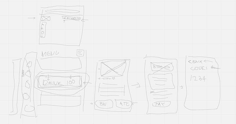
Our iteration above received some of the criticisms from our mentors. So here are some tips to avoid making the same mistakes we did:
- Some options should not be displayed if the user can’t currently access them.
- After a user completes an objective (e.g. adding a coffee to cart), ask yourself, “Where is the best page to redirect the user?”
- Always consider if you can redesign the wireframe so that there are fewer steps to achieve an objective.
We then put our ideas into a cleaner wireframe through Balsamiq, a desktop application for creating wireframes.
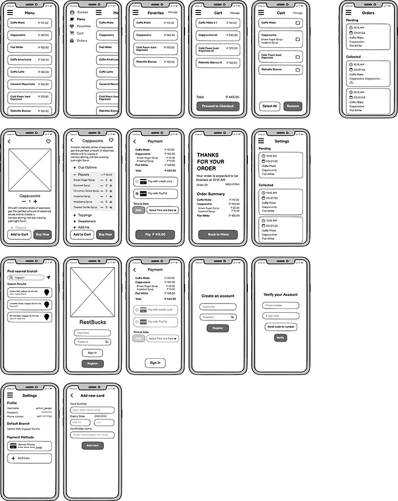
After going through more ideas and choices, such as picking among accordion, carousel or just plain list, deciding whether the menu should be on the top or the left side, analyzing if the menu bar should be hidden when not needed, and determining if more information is needed in certain pages — our final set of wireframes looked like this:
4. Test the Wireframe
The penultimate step in creating an app with a great UX is to give the wireframe to a tester and allow them to go through your application. In this stage, having a wireframing tool such as Balsamiq is very helpful, if not crucial. Wireframing tools allow you to route components to a different page upon clicking them, simulating a real application.
For the testing to be effective and bias-free, we were told not to provide step-by-step instructions to the tester. The instructions just need to be general enough so that the tester can make decisions of their own while exploring the application. Giving the tester the freedom to navigate through the application will allow you to observe their behavior as they go through the process of achieving your specified objective. Steve Krug explains this concept very well in one of his books, “Rocket Surgery Made Easy” as well as in his sample usability testing.
In our application, the instructions we provided were along the lines of: “Order a coffee”, or “‘Favorite’ a coffee”. Give simple objectives, and when observing the tester, feel free to ask them to be vocal about what they are feeling while going through your application. If you are using a desktop, you can record and highlight their mouse cursor so that you can see where on the screen the testers are looking once you review your recording.
Analyze the tester’s steps when navigating through your app. At each page that they visit, here are some observations that you and your team should take note of:
- Did the tester have a hard time finding the right buttons to reach their desired page? Why?
- What were they expecting to see upon clicking a certain button?
- What page did they end up in instead?
- How many button clicks did it take for the tester to achieve the objective? Is this a lot more or less than what you expected?
- Did they click the wrong buttons while attempting to get something done?
These questions make you figure out which buttons are hard to find, poorly labeled, and are generally unintuitive. Your testers might even be able to suggest more optimal button placements, sizes, and labels.
Fortunately for us, our wireframe discussions with our mentors greatly helped us in creating user-friendly wireframes. Our testers were able to quickly find what they were looking for with ease.
5. Iterate
Of course, creating the perfect UX for your app does not end in the first testing. You still need to apply what you’ve learned from the testing and redesign your wireframes. You might need to move a button to a different part of the page, change a button label or two, or even completely redesign a page if you have to.
After you have created an iteration of your application, make testers have another go at it — they might spot some new aspects that need improvement. Having a pair of eyes from outside your team (including non-developers) to check on your application is important, because you can get opinions from a possible target user who may not be as tech savvy as yourselves. Again, you don’t want your application to be confusing to navigate. Additionally, simply reviewing your own work may not be enough, because you’ve spent so much time looking at your own designs that you probably can’t easily see it from a fresh perspective.
In our case, our tester suggested that we could add a toast or some form of notification to inform the user that their drink was actually added to their cart.
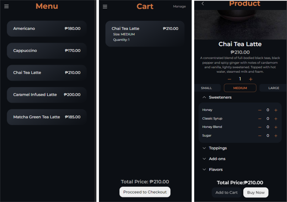
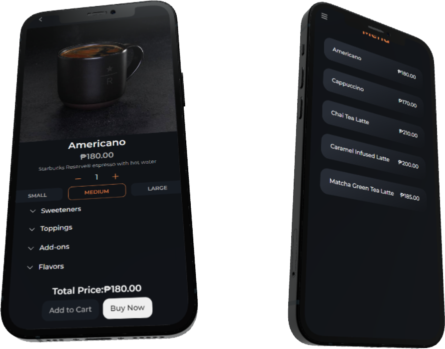
After going through the stages mentioned above, here’s a peek into what our coffee shop application looks like now:
Interested in a more hands-on learning experience on how to build apps with great UX? Join O&B’s engineering internship program!
Share


Audiences
Capabilities
Perspectives
Key Topics

Article
Women Who Code: Transforming the Tech Landscape with Diversity and Skill
Key Takeaways Introduction Over the years, gender inclusivity has constantly been a subject of dispute...

Article
Embracing EQ in UX: A New Era for the Philippines National Skills Framework
Key Insights Introduction The Philippines has long stood as a bastion of warmth and understanding,...
Article
Transforming Tech Talent: Philippines Introduces Game-Changing National Skills Framework for IT Excellence
In today’s rapidly advancing technological world, the gap between academic learning and industry requirements in...